Why Are Colours So Important in Food Perception?
Trends
6th December 2021
It is certainly not surprising to read that what we eat – or drink – affects how we feel: choosing the right foods can certainly affect our physical health, but it can also help improve our mood, increase our vital energy, and even improve our brain function. When we talk about food choices, however, there is something that goes beyond the correct nutritional intake and the balance between starches, proteins, sugars, fibres, and vitamins: the first, and perhaps most important, point of contact with food is colour.
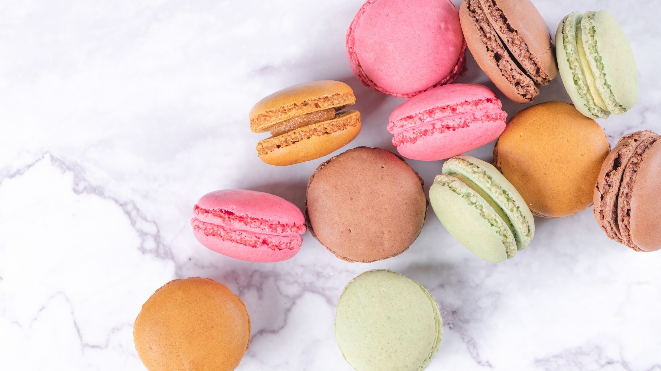
According to British psychologist Charles Spence, ‘Colour is the single most important sensory element intrinsic to a product when it comes to expectations about the taste experience of a food or drink’. Sight – and secondly smell – are the two most powerful senses when it comes to choosing what to eat or drink: we are certainly more attracted by a beautiful bright red jam (strawberries, or cherries, or raspberries) than by an amorphous grey one… and we can already taste the sweetness, the slight acid note, the persistence in the mouth.
The choice of colour is therefore of the utmost importance when developing a new product: it is the business card that allows that product to act in the subconscious of the end consumer, who will associate that colour with an expectation of taste and, consequently, of mood. Winning products are always those that ‘tempt’ the taste buds by catching our eye. And according to various studies on the purchasing behaviour of modern consumers, disregarding consumer expectations by choosing ‘break’ colours may not be the winning choice: colour is part of the sensory information that has allowed us to stay alive and evolve as a species, thanks to what happens in the amygdala.
At Nactarome we can count on more than a century of experience in the world of food colours thanks to the legacy of FiorioColori. Beyond the technical expertise, the strong focus on natural and colour extracts to meet the growing consumer demand for understandable labels and recognisable ingredients, we are deeply aware of the strong psychological impact of colours on your end consumers.
We carefully select the best raw materials to offer natural food colours that are bright, stable, and perfectly suited to every application, developed with cutting-edge technology and careful to preserve the original intrinsic characteristics. From beetroot to turmeric, from carrot to spirulina, our supply chain is safe, controlled, sustainable and natural.
However, declarability on the label is only one aspect of choosing the right colour for a product. The performance of food colours, especially colouring foodstuffs, depends on acidity, light, temperature, turbidity, and other ingredients in the final formulation, with which they may interact, and which may affect stability and oxidative processes. This is why our philosophy is to be a technical partner in the development of our customers’ products, to identify the type of colour that best suits the composition and best responds to the final positioning.
We also know that red is the colour that stimulates the appetite more than any other, that yellow evokes positivity, optimism, joy. We know that orange is associated with feelings of creativity, adventure, enthusiasm, success, and balance, while purple is associated with royalty, power, luxury: if we wish to make a product with a ‘premium’, aspirational, or perhaps limited-edition positioning, purple and the natural products linked to it, such as purple carrots and potatoes, cabbage, blueberries, elderberries, are definitely our first choice.
Would you like to find out more about our FiorioColori brand offer? Contact us on info@nactarome.eu