


Amber Toast: A Warm Palette for Food and Beverage Innovation
Trends
5th November 2026
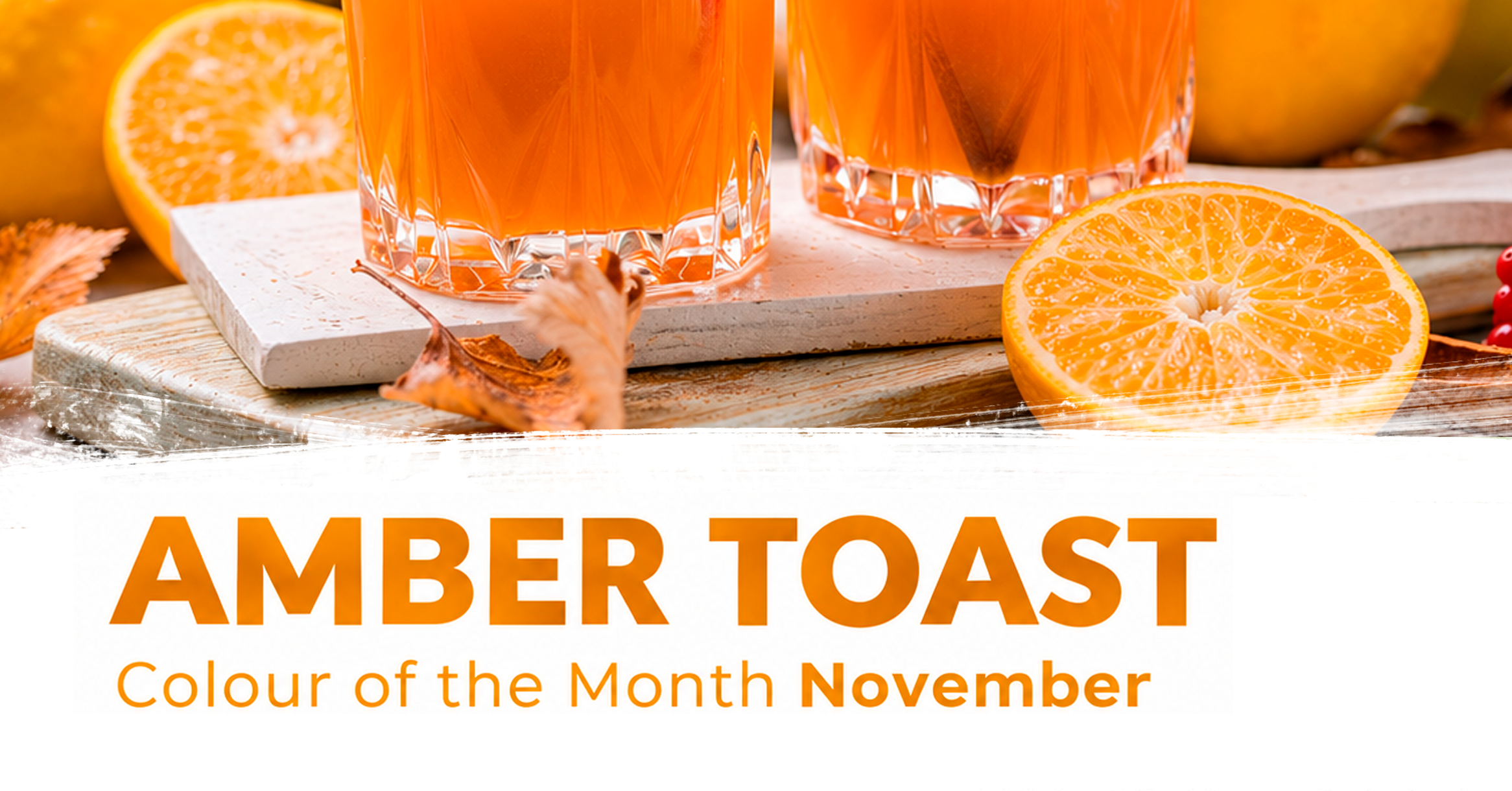
A golden drink, an amber glaze, the inviting shade of toasted sugar. Some colours suggest an entire eating experience before the first sip or bite. Meet Amber Toast, Nactarome’s Colour of the Month for November.
This month’s inspiration starts with a glass: a warm orange-amber drink, finished with apple and cinnamon, surrounded by the textures of autumn. Its appeal comes from the way colour brings the scene together. Golden light, fruit and spice create a visual invitation to pause and enjoy.
For food and beverage developers, Amber Toast offers a palette to explore, from luminous gold and warm orange to deeper caramelised tones. It is a creative direction rather than a single ingredient or fixed formulation, with different solutions available to suit different product ideas.
Start with the impression you want to create
What should your product suggest at first glance? A bright golden drink might set the scene for a fruit-led concept, while a deeper amber dessert layer could complement a more indulgent recipe. Both belong within the Amber Toast palette, but each tells a different story.
Apple and cinnamon provide an appealing seasonal starting point. Other directions might draw on citrus, baked fruit or caramel-inspired recipes. The colour helps frame the concept; the ingredients and flavour system deliver the taste. Keeping those roles clear helps create a product whose appearance and eating experience work together.
Golden and orange possibilities for beverages
For beverage concepts exploring the brighter side of Amber Toast, Nactarome’s natural beta-carotene solutions offer a route to golden and orange shades. The chosen solution, dosage and beverage base all contribute to the final appearance.
Imagine developing a seasonal fruit drink, a citrus-led mocktail or a beverage inspired by apple and spice. Colour can help establish a visual identity for the range, whether the brief calls for a gentle golden impression or a fuller orange expression.
Beta-carotene’s role here is colour. Apple, cinnamon and toasted flavour notes come from the recipe’s other components. The development task is to bring those elements into balance, selecting the colour approach around the actual drink rather than judging it in isolation.
Explore the caramelised side with Royal Buisman
Another interpretation of Amber Toast draws on the colour of caramelised sugar. Royal Buisman, part of the Nactarome group, produces caramelised sugar ingredients that offer a separate route into this warm visual territory.
The range includes different colour expressions, making ingredient selection central to the brief. A developer looking for a lighter golden-brown impression will have different priorities from one seeking greater depth. The selected reference and its contribution to the complete recipe should guide the choice.
These ingredients and beta-carotene serve different formulation purposes. They need not be combined to express the Amber Toast concept, and they should not be expected to produce an identical result. The opportunity lies in choosing the approach that fits the product.
Let the palette travel beyond the glass
Picture the same seasonal idea translated into a pastry: a pale cream filling beside an amber fruit preparation, or a warm-toned glaze against a golden baked surface. Contrast can give the colour as much presence as using it throughout a product.
In confectionery, developers might explore a golden jelly or a caramel-inspired centre. A layered dessert could pair a lighter base with a deeper coloured topping. Each is a creative brief to investigate with an appropriate ingredient solution, rather than a promise that one colour system will suit every format.
Build the shade in the finished recipe
Start application trials with a clear visual target. Assess the colour in the actual base, after the intended process and throughout the proposed storage period. The base colour, acidity, dosage, processing conditions and exposure to light or oxygen may all influence the outcome.
Amber Toast is an invitation to turn a warm palette into a product with its own identity. Contact Nactarome to explore natural colour solutions and Royal Buisman caramelised sugar ingredients for your next development.
